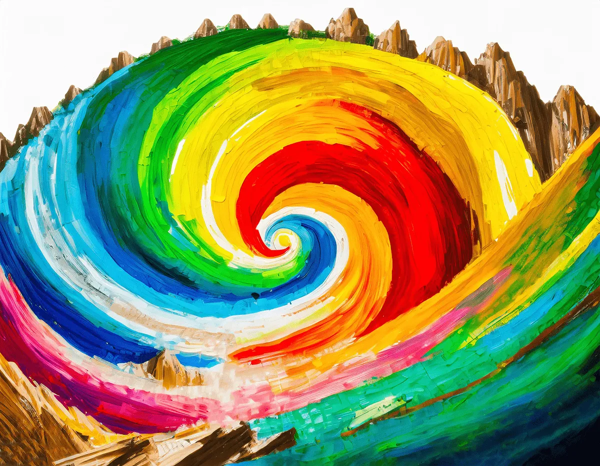
In the world of design, color is like a magical paintbrush, able to captivate our attention, evoke emotions, and shape our perceptions.
Color theory, the study of how colors interact and affect us, is like a secret decoder ring, revealing the hidden language of colors and empowering designers to harness their power.
The Color Wheel: A Foundation for Harmonious Composition
Imagine the color wheel as your trusty compass in the design world. It’s a visual representation of color relationships, where primary colors like red, yellow, and blue form the foundation.
Mix them, and you get secondary colors like orange, green, and purple. Add a dash of these secondary colors to primary colors, and you get tertiary colors, like red-orange, yellow-orange, and so on.
Understanding these relationships is like knowing the secret handshake of color harmony.
Color Harmony: Achieving Visual Unity and Emotive Impact
The art of combining colors effectively is a crucial aspect of successful design. Designers employ various color harmony principles to create visually pleasing and impactful designs.
Analogous Colors
Colors adjacent to each other on the color wheel create a sense of unity and calmness, often associated with nature and serenity.
Complementary Colors
Colors opposite each other on the color wheel create high contrast and energy, often used to highlight specific elements or create visual drama.
Triadic Colors
Colors evenly spaced around the color wheel form a dynamic and balanced combination, offering a harmonious blend of contrast and unity.
Color Psychology: The Emotional Power of Colors
Color psychology explores the associations and emotional responses that different colors evoke. Designers can leverage color psychology to influence the mood and perception of their designs, effectively communicating their message to the audience.
- Red: Passion, energy, danger, urgency
- Orange: Warmth, enthusiasm, creativity, excitement
- Yellow: Happiness, optimism, creativity, confidence
- Green: Nature, growth, freshness, harmony, health
- Blue: Tranquility, trust, sadness, peace
- Purple: Royalty, mystery, creativity, wisdom
Color Application in Design
Color theory finds applications across various design disciplines, including:
- Graphic Design: Brand identity, logos, marketing materials, brochures, posters, packaging
- Web Design: User interface, website layouts, typography, buttons, navigation
- Interior Design: Space planning, furniture selection, color schemes, lighting
- Fashion Design: Clothing, accessories, color trends
Color Tools and Resources
Numerous tools and resources are available to aid designers in exploring and applying color theory effectively.
Pantone: A global color authority providing comprehensive color palettes, tools, and inspiration.
Color Psychology Websites: Websites offering insights into the emotional impact of colors, color associations, and cultural symbolism.
Online Color Pickers and Tools: Websites and apps allow designers to experiment with different color combinations, harmonies, and palettes.
Conclusion
Color theory is an intricate and fascinating discipline that lies at the heart of effective design. By understanding the principles of color harmony, color psychology, and the application of color in various design fields, designers can harness the power of color to create designs that engage, communicate, and captivate their audience, leaving a lasting impression.


